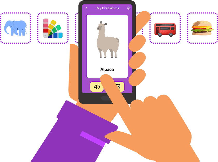
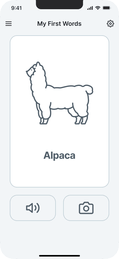
My First Words
Redesigning a children's education app and website to increase the conversion rate
Overview
Vitamina K is a design agency which specializes in building no-code apps. I collaborated with 2 designers to redesign a mobile app that supports vocabulary development in toddlers and the accompanying web landing page. The app, My First 150 Words, achieved a 19.3% conversion rate one month after launch.
As part of a 3-person team, I was involved in the entire design process and worked closely on research, concept development, prototyping, and validation.
Role
Product Designer
Timeline
1 month
Featured Skills
Interaction Design
Prototyping
UX Writing
Usability Testing
Team
Katerina Sevcovic
Jasmine Dania
Karla Fernandes
Project Brief
Redesigning the "100 Animals" app to increase conversions.
Vitamina K has developed an app, 100 Animals, which support language development in toddlers. The app uses flash cards to introduce children to vocabulary about animals and comes in a free version and a paid version. The founder of Vitamina K wanted our team to help her drive more conversions to the free app by redesigning the web landing page and drive more conversions to the paid app by proposing a new feature in the free app that could enhance the user experience.
Data revealed a lack of interest in purchasing the paid app.
The data showed that most of the downloads were for the lite app (228 downloads of the lite app from the App Store versus 87 for the paid app). Users demonstrated a lack of interest in purchasing the paid app.
Business Goals
1
Increase conversions to the lite app through the web landing page.
2
Increase conversions to the paid app through the lite app.
My Team's Objective
1
Redesign the web landing page to encourage parents to download the free version of the 100 Animals app.
2
Create a more educational and engaging experience for toddlers in the free app to encourage parents to convert to the paid app.
Outcomes
We delivered research (audit of existing website and app, user survey insights, competitive analysis, and secondary research), wireframes, high fidelity prototypes, and user feedback from two rounds of usability testing.
Based on my team's design proposals, Vitamina K developed a brand new app called "My First 150 Words," which achieved a 19.3% conversion rate within 1 month after launching in the App Store and Google Play Store.
Audit of Existing Website and App
Auditing the 100 Animals website and app revealed crucial issues with both.
To better understand why users were not inclined to purchase the paid app, I conducted an audit of the existing website and app, uncovering issues that could be causing the low conversion rate.
Finding 1
It's unclear how the paid app differs from the free app
The website displays a free and paid version of the app, but doesn't explain what the difference is. Users would not be inclined to buy the paid app if they don’t know what additional features it has.
Finding 2
Purpose of the app is unclear
It's unclear whether the app’s purpose is to teach words in the native language or a secondary language. In the banner image, there are flags from different countries which implies that there’s a multilingual feature in the app, but you don’t hear anything about learning different languages until you get to the bottom of the page.
Finding 3
Top banner doesn't say what the app is for
The top banner doesn’t explain what the app is for. Users have to scroll down to read the description. Users should be able to see the top banner and quickly know what the app is for.
Finding 4
Information could be arranged differently
At the bottom of the page there’s an accordion menu with information about the purpose and content of the app. Since this information is important for users to understand the app, it should be displayed more prominently and not hidden behind a drop down menu.
Finding 5
Accessibility and typography issues
In the accordion menu at the bottom of the page, the white text on the orange background is hard to read. Also, the typography is inconsistent. For example, the body text “Bright illustrations, real pictures…” uses a serif font while the body text in the accordion menu uses a creative font.

Findings from the App
Finding 1
Limited educational content in both the free and paid versions of the app
The app doesn’t provide any other content besides the animal name, illustration, pronunciation, and picture.
Finding 2
Free app doesn't seem like it would convince parents to convert to the paid app
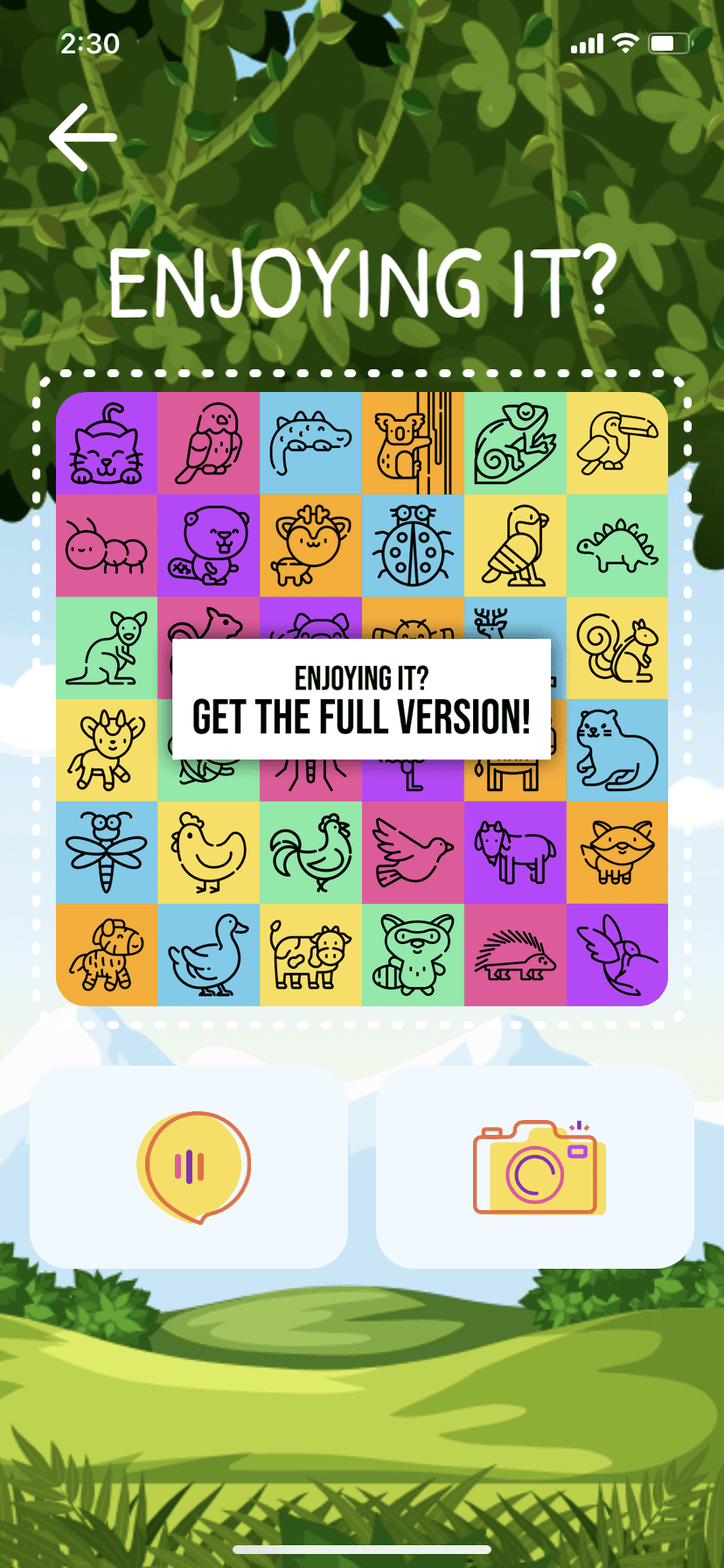
The “Enjoying it? Get the full version” card should explain what the features of the paid app are and the price. It should also contain a button that takes you directly to the App Store to download the paid app, so that you don't have to open the App Store and search for "100 Animals."
User testing confirmed the audit findings and uncovered user preferences
To see how users would react to the existing 100 Animals website and lite app, we conducted usability testing with 3 participants in total (2 parents and 1 non-parent). Our participants' reactions to the website and app confirmed the findings from the audit. None of them could clearly tell what the app was for and how the free and paid versions differed. They all agreed that the app was lacking in educational value and wanted to see more content than just the animal name, sound, and picture if they were to pay for the app.
Competitive Analysis
I analyzed the websites for 3 children's educational apps to identify features to incorporate into the 100 Animals site.
I focused on the techniques that the competitor websites used to convey the purpose and value of their product and encourage conversions.
Features to take away
Explain how the paid app differs from the free app.
Have a clear description of what the app is in the top banner.
Use negative space to highlight important elements and make the page easy to scan.
Use typography to support information hierarchy and make the page easy to scan.
Use playful imagery to illustrate the app features.

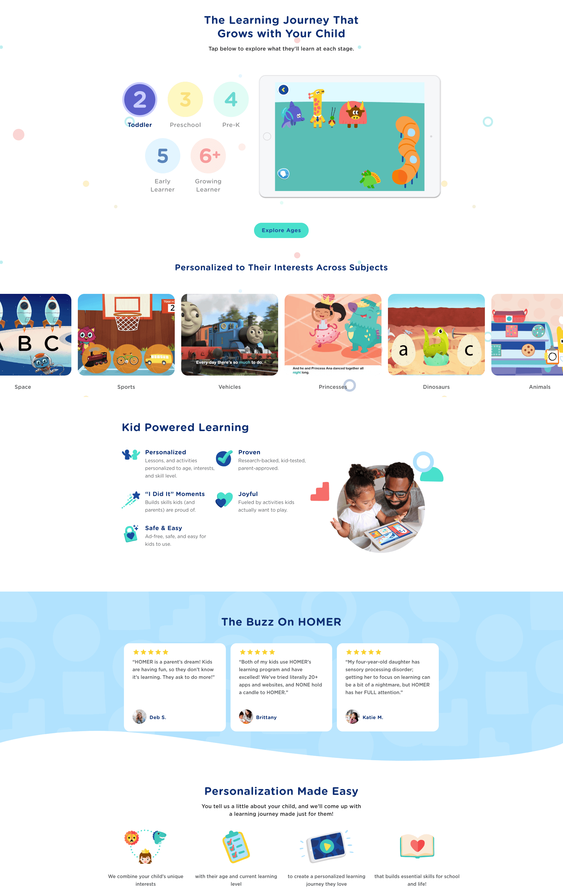
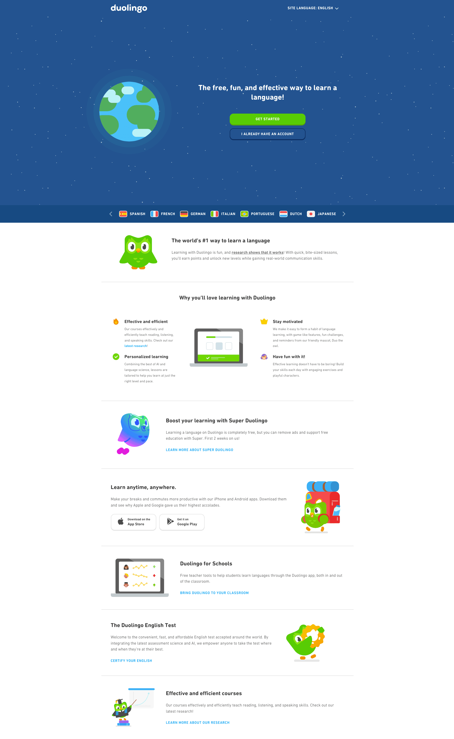
Competitor websites: Khan Academy Kids, Homer, and Duolingo
Discovery Research
Exploring parental preferences for children's apps
We conducted secondary research to explore the two problem spaces that we were working with: 1) how to create a web landing page that would convince parents to try out the app and 2) how to create a lite app that parents would find valuable for their children and convince them to upgrade to the paid app. My own research focused on what features parents desire in apps for their children.
Parents want an app that:
Is entertaining and fosters independent play
Encourages learning with content that the parent can control.
Has content that is familiar yet challenging to the child
Occupies the child's time so that the parent can do other things
We conducted a survey among potential users, receiving 15 responses.
The survey respondents were all parents of young children. Our goal was to identify what additional features they desire in apps for their children and what makes them willing to pay for the app. The responses provided us with data to generate insights from.
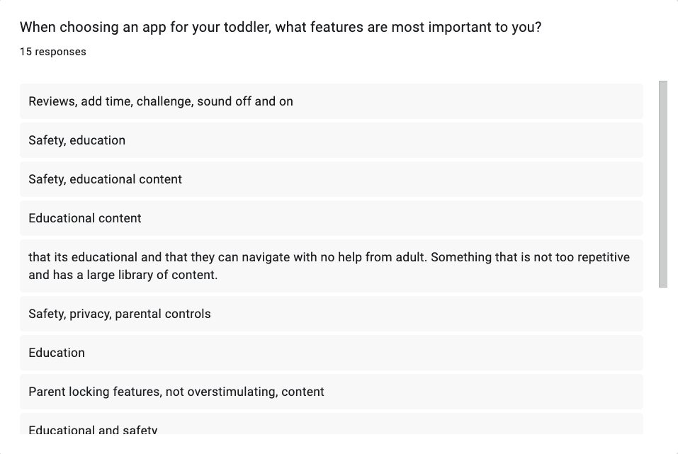
A sample from our survey.
Research synthesis
We found that parents desire these features when choosing an app for their child.
Education/Learning
Parents want apps that contain educational content and make learning fun for their child.
Entertainment
Parents want to keep their child entertained, especially in situations where they can’t pay them full attention such as during a flight.
Independence
Parents want apps that the child can use independently without help from the parent.
Variety
Parents want apps that offer a large variety of content and aren’t too repetitive
Catering to the parent user
From the project brief and research we arrived at two user types: 1) the parent who is choosing the app and 2) the toddler who is playing with the app. However, it was clear that the parent was the target user since they would be the ones purchasing the app. To ensure that our designs were aligned with the goals, needs, and pain points of the parent user, we created a persona.
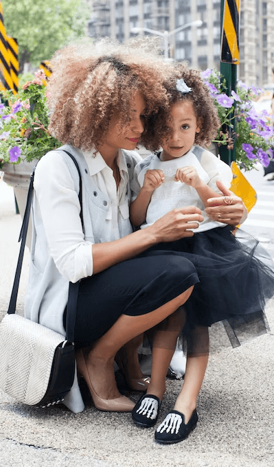
Janet: The Busy Mom
Bio
Busy mom of a 2 year old toddler named Emma.
Always looking for ways to keep Emma engaged in fun and educational activities.
Has been using various free educational apps such as YouTube and Khan Academy Kids, but is willing to pay for an app as long as it provides educational value.
Goals
Find a educational app that makes learning fun for Emma, offers a variety of content, and is age-appropriate.
Keep Emma entertained during long car rides and trips.
Find an app that is intuitive for Emma to use alone and doesn’t require parental assistance.
Pain Points
It’s difficult to determine if an app is appropriate for Emma during the search process.
Many apps fail to keep Emma engaged and require parental assistance
Design challenges
How might we…
Create a web landing page that convinces parents to try out the free version of the 100 animals app?
Enhance the educational content of the free app to increase children’s learning and convince parents to purchase the paid version?
Make the app more engaging and intuitive for children to use on their own to help parents gain more free time?
User flow
I created a user flow to visualize the interactions that the user would take to purchase the 100 Animals app.
The user browses the 100 Animals website, decides to try out the lite app, downloads it from their phone's app store, tries it out to see if it's a good fit for their child, sees the screen that advertises the paid app, and clicks on a button that takes them to the app store where they download the paid app.
While the user flow that I created is largely the same as the current path that users take, I added additional features to the website to make the app more convincing for users to download, based on the issues identified from the audit and usability testing and the takeaways from the competitive analysis.
Accommodating the need for a seamless user experience and the client's technical limitations
For the most ideal user experience, there would be a single 100 Animals app that the user can download for free and make an in-app purchase to unlock the premium content. That way, the user wouldn't have to leave the 100 Animals app to go to the app store. However, the client had built 100 Animals using no-code tools, which don't allow for in-app purchases.

Design Development (App)
Improving educational value and usability.
I created sketches to explore different possibilities for what a redesigned app could look like, with the goal being to resolve the issues identified from the audit. After our team agreed on which features to include from the sketches, I created wireframes for the app screens, which allowed me to convey how the user would interact with the app.
Navigating technical constraints
Participants' main impression of the 100 animals app is that it has limited educational content. Our initial idea was to add more information to each flashcard, such as a fun fact about the animal. However, because the app comes in 6 different languages, this idea would create too much translation work for the founder of Vitamina K. Instead, she accepted our idea to expand the number of flashcard categories and rename the app to "My First Words."
Wireframes
Sketches
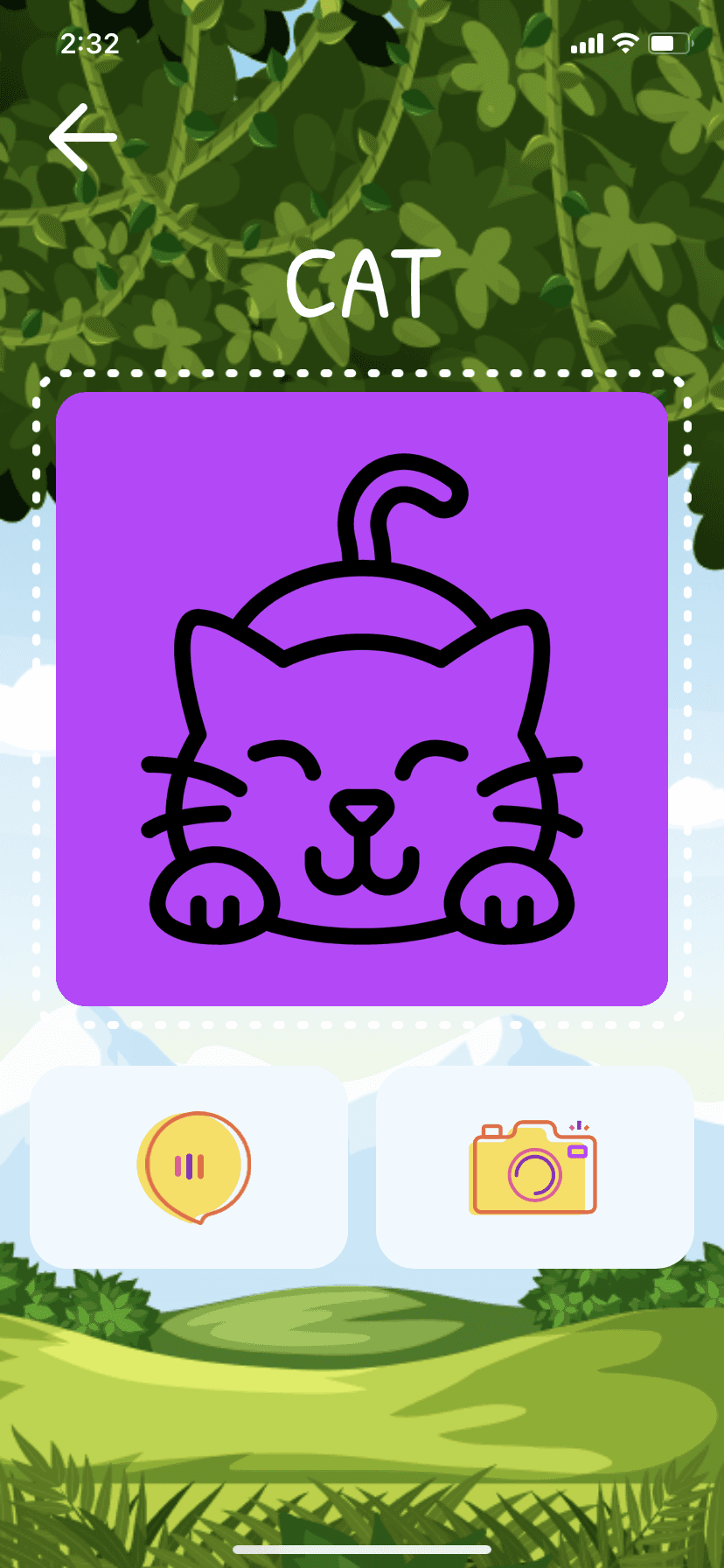
Card with illustration

Card with photograph

"Enjoying it?" card
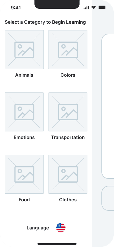
Select category screen
App Changes
1) Expanded the number of flashcard categories from 1 to 6 to increase the educational value of the app.
2) Renamed the app from "100 Animals" to "My First Words" because the content is no longer solely about animals.
3) Created a sidebar menu for navigating between the categories.
4) Added a button in the "Enjoying it?" card to allow the user to go directly the app store to download the paid app and clarified the difference between the paid app and lite app.
Testing and Iterating (App)
We conducted a round of usability testing with 6 participants to validate the app wireframes.
The goals of the testing were 1) see how users would interpret the app and 2) find out what content they expected to see. We asked questions such as "How would you navigate to the next card?"
After testing I created a high-fidelity prototype for app, making changes based on the findings from usability testing. By adding imagery and colors, we were able to create a more playful and appealing in-app experience.
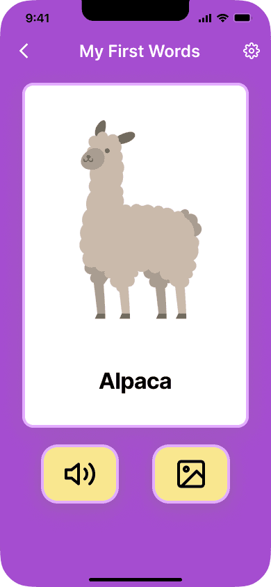
Finding 1: Participants didn't know what the picture button was for.
Participants didn't expect the picture button to display a photograph of the animal because they associated a camera icon with taking a picture rather than displaying a picture. Using different icon would better convey the meaning of the picture button.
Change: Replaced the camera icon with an image icon to make it more clear that this button is for displaying a picture of the item in the card.
Before
After
Finding 2: The “Enjoying it?” card, which prompts the parent to download the paid app, feels out of place and lacks info.
Children are the primary users of the app, but the “Enjoying it?” card is targeted at adults. Participants felt that this card would disrupt the experience for the child. They also felt that it doesn't contain enough information about the paid app to convince them to purchase it.
Change: Removed the “Enjoying it?” card and redesigned the flow so that the parent clicks on one of the locked categories and sees the "Unlock Full App" page which prompts them to purchase the paid app. This page shows the price of the paid app and makes it more clear what the features of the paid app are and why the parent should upgrade to it.
Before
After

Finding 3: Participants felt that the app should track the child's progress.
You can’t tell which words you’ve learned and which ones you haven’t. Having a tracking feature that shows which words have already been learned and which ones haven't would give the child a sense of accomplishment and encourage them to keep using the app. This idea falls outside of the project's scope, but could be a future addition.
We conducted a 2nd round of usability testing with 6 participants to validate the high-fidelity designs.
The goals of testing were 1) see if the usability issues with the app were resolved, and 2) see participants' impression of the app UI.
Finding 1: Improved understanding of the picture button.
Most participants could tell that the picture button was for displaying a photograph of the item in the flashcard. However one participant was unsure of what this button was for. Another participant knew what the picture button was for, but felt that her child might not understand it. Moving forward, A/B testing could be done to determine what kind of button is most effective.
Finding 2: Improved understanding of the difference between the lite app and paid app
With the reiterated app, all participants could tell what features were offered by the paid app and how the paid app differs from the lite app.
Design Development (Website)
I designed a web landing page that would spark parents' interest in the free app and encourage conversions.
I created sketches to explore different possibilities for what a redesigned web landing page would look like with the goal being to resolve the issues identified from the audit of the existing landing page and app.
After our team agreed on which features to include from the sketches, I created wireframes which allowed me to define the layout and content of the landing page.
Wireframes
Sketches

Website Changes
1) A clear description of what the app is for in the top banner.
2) A section explaining how using the app can benefit children (and parents).
3) A testimonials section to provide social proof.
4) A side-by-side comparison of the lite app and paid app.
Testing and Iterating (Website)
We conducted a round of usability testing with 6 particpants to validate the website wireframes.
The goals of the testing were 1) see how participants would interpret the web landing page and 2) find out what content they expected to see. We asked participants questions such as "What do you think this app is about?"
Once the evaluations were done, I designed high-quality mockups for the site, amending them according to the results from the user experience testing. The incorporation of visuals and hues enhanced the portrayal of the app's purpose and benefits on our web platform.
Finding 1: Participants wanted a clearer understanding of how the app works.
Participants could tell that the purpose of the app is teaching children new vocabulary, but they didn’t understand how the vocabulary would be taught. They thought it would be helpful to have a mockup or GIF demonstrating how the app works.
Change: In the top banner, I added an illustration of the hand swiping the app screen to help the user understand how the app works. Behind the main illustration, I added cards with the category images to give a preview of the app’s content.

Finding 2: Participants want to try out the free version of the app before purchasing it.
All participants said that they want to try the free version before paying for any app. Increasing conversions to the paid app by enhancing the lite app is the right business strategy for the client.
We conducted a 2nd round of usability testing with 6 participants to validate the high-fidelity designs.
The goals of testing were 1) see how participants interpret the reiterated website after incorporating changes based on previous feedback and 2) see participants' impression of the website UI.
Finding 1: Improved understanding of how the app works.
With the high-fidelity design, participants could now tell how the app works by looking at the illustration in the top banner.
Finding 2: Participants wanted to see consistent illustration styles.
As we increased the variety of categories within the app, we needed to venture beyond the client's existing assets and locate alternative illustrations to portray these categories. Consequently, this led to a lack of consistency in illustration styles. A unified illustration approach should be employed for all components on the landing page. Moving forward, the client should acquire a series of illustrations to substitute the ones we utilized as placeholders.
Finding 3: One participant didn't know which languages the flags represented.
Change: We added labels underneath each flag to ensure that all users know which languages the app comes in.

Style Guide
Expressing a playful brand identity
When creating the high fidelity designs, we incorporated elements from the client's existing style guide while making changes to improve the visual design. Considering that the app is used by children, we wanted to create a user interface that embodied playfulness. Our colors were based off the original 100 Animals brand colors with some adjustments while the typography was adopted from an existing UI kit.

Final High Fidelity Design
After making some changes to the UI, we handed off the final designs for the website and app to the founder.
Final My First Words Website

Final My First Words App Design


Conclusion
Feedback from the founder of Vitamina K
We presented our work to the founder of Vitamina K and handed off all of the deliverables in a Figma file. She was impressed with our output and believed that our design proposals have the potential to drive conversions.
"The team of designers worked tirelessly to create an appealing and user-friendly mid-fidelity design that resonated with parents and children. Their skillset delivered excellent results with each iteration, introducing new features based on user feedback and identifying key factors that parents consider when choosing apps for their children."
-Karla Fernandes, Founder and CEO of Vitamina K
Reflection and Next Steps
Working on a client project challenged me to find the mutual ground between business goals and user needs and deliver the most impactful solution within the client's technical constraints. I learned how to better communicate the rationale behind my design decisions using data while also adapting to shifting expectations.
The next step for our client is to implement our design proposals into the landing page and app. Since we expanded the categories of the app, Karla will have to produce content for all of those new words and officially rename the app as My First Words or a similar name. After Karla implements the redesign, she will provide us with data to measure the impact on the app conversion rate.
Impact After Launch
In August 2023, our client launched a new app, My First 150 Words, incorporating our design proposals. The app achieved a 19.3% conversion rate within 1 month after launching in the App Store and Google Play Store (with 114 total downloads).