Gallery Pal
Improving the visitor experience at art museums


Role
Sole UX/UI Designer and Researcher
Timeline
December 2022 - February 2023
Tools
Figma, InVision
Overview
Background
GalleryPal is a startup that aims to improve the experience of viewing art in a museum or gallery.
My role was to design a mobile solution to improve the in-person viewing experience for visitors at the Museum of Scandinavian Art, using insights from the research provided to me. To quickly design and test a solution on users, I adopted a modified, one-person version of the Google Ventures Design Sprint, which took place over the course of 5 days.
Problem
Research has shown that visitors are leaving the museum dissatisfied and feeling as if they’re not getting the most out of their experience.
Solution
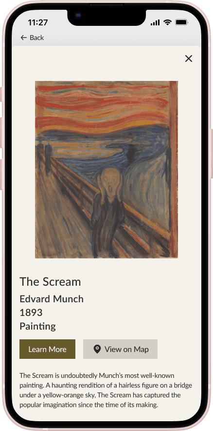
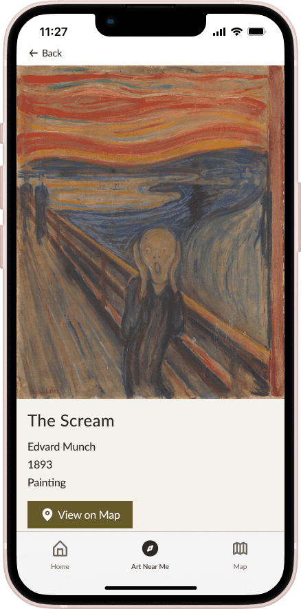
A mobile app that allows users to easily identify artwork that they see in-person and absorb meaningful information about it.
Enabled by location tracking, the app displays all the artwork that’s physically near the user, sorted by distance. Selecting an artwork from the “Art Near Me" page will display relevant information, formatted as easily digestible pieces of text, audio, and video.

Day 1: Understand and Map
Insights from User and Expert Interviews
To understand the problem space and identify a design objective, I reviewed the research that was provided to me by the client.
Users feel as if they’re missing out on the full experience at the museum by not knowing more about the art.
The information that they find online is usually long and dense, causing them to lose interest.
Users like having the flexibility to look at art at their own pace, but also like hearing expert knowledge.
Users enjoy the feeling of discovering something new.
Considering the Amateur Museum Goer
I was provided with a persona, which helped me define the user that I would be designing for.
Angela
23 years old
Junior Art Director
New York, NY
Bio
Goes to art museums every couple of months, usually by herself
Doesn't look for specific exhibitions or artists, just browses whatever is being showcased
Enjoys her visits but doesn't know a lot about the art
Goals
Get quick information while looking at the art
Gain a better appreciation for the art
Feel that she is making the most out of her visit
Pain Points
Lack of knowledge about the art makes her feel as if she's missing out on the full experience
Books and articles about the art are too long and in-depth, causing her to lose interest
Identifying Design Challenges
How might we…
Provide users with meaningful information about the art in an easy to digest format?
Enable users to consume expert knowledge about the art at their own pace?
Help users gain a deeper appreciation for the art?
Instill in users a sense of curiosity and eagerness to explore?
User Map
I created a user map to visualize the steps that the user would take to achieve their goals using GalleryPal.
Mapping the user experience required me to consider the circumstances under which the user would be using the app. I had to think about when the user would realistically download the app, what path they would take within the museum, what method would make sense for retrieving information about the art, and what kind of content would be engaging.

Day 2: Sketching a Solution
Gathering Inspiration
I analyzed two apps that deal with the same problem space to identify features that I could incorporate into my solution. Here are the features that I want to take away.
Concise and meaningful content in different formats
Story-telling
Discoverability of art and artists
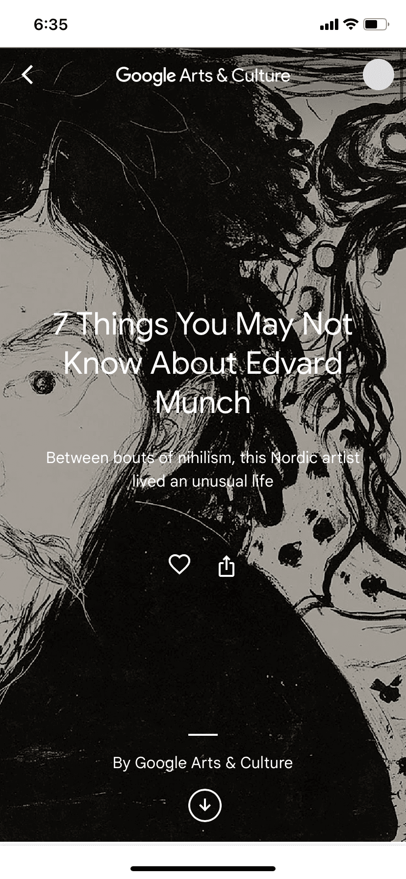
Google Arts and Culture
Artsy


Likes
Easy discovery of artworks and artists. The user can go to the artist’s page to explore art by that artist in a gallery format. At the bottom of each artwork’s page, the user is shown related artworks and an explanation of why that artwork is related, such as “same subject matter.”
Dynamic presentation of information. For example, as the user scrolls through the article about Lee Kraser the app will zoom in on certain parts of the art to highlight details and provide information, creating a dynamic experience.
Storytelling is used to engage the user, giving them the context to appreciate the art more deeply.
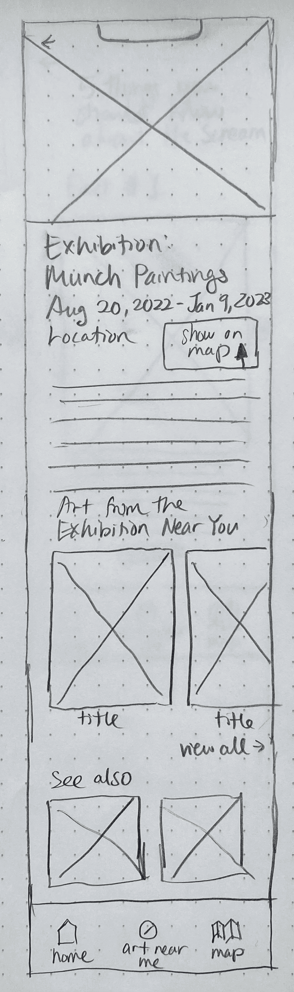
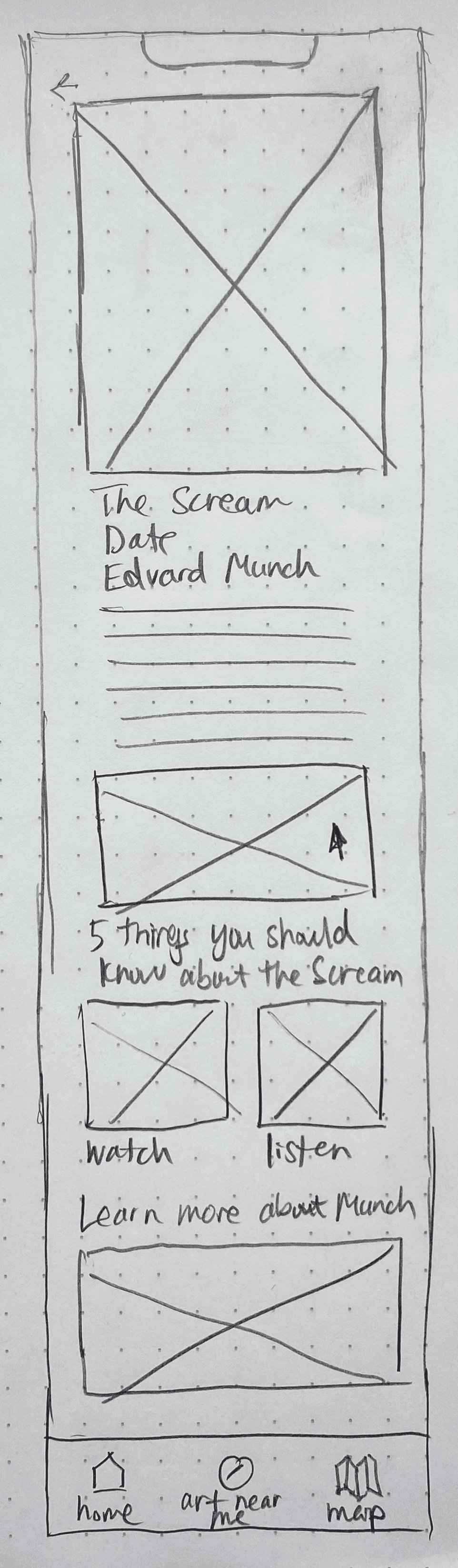
Crazy 8 Sketches
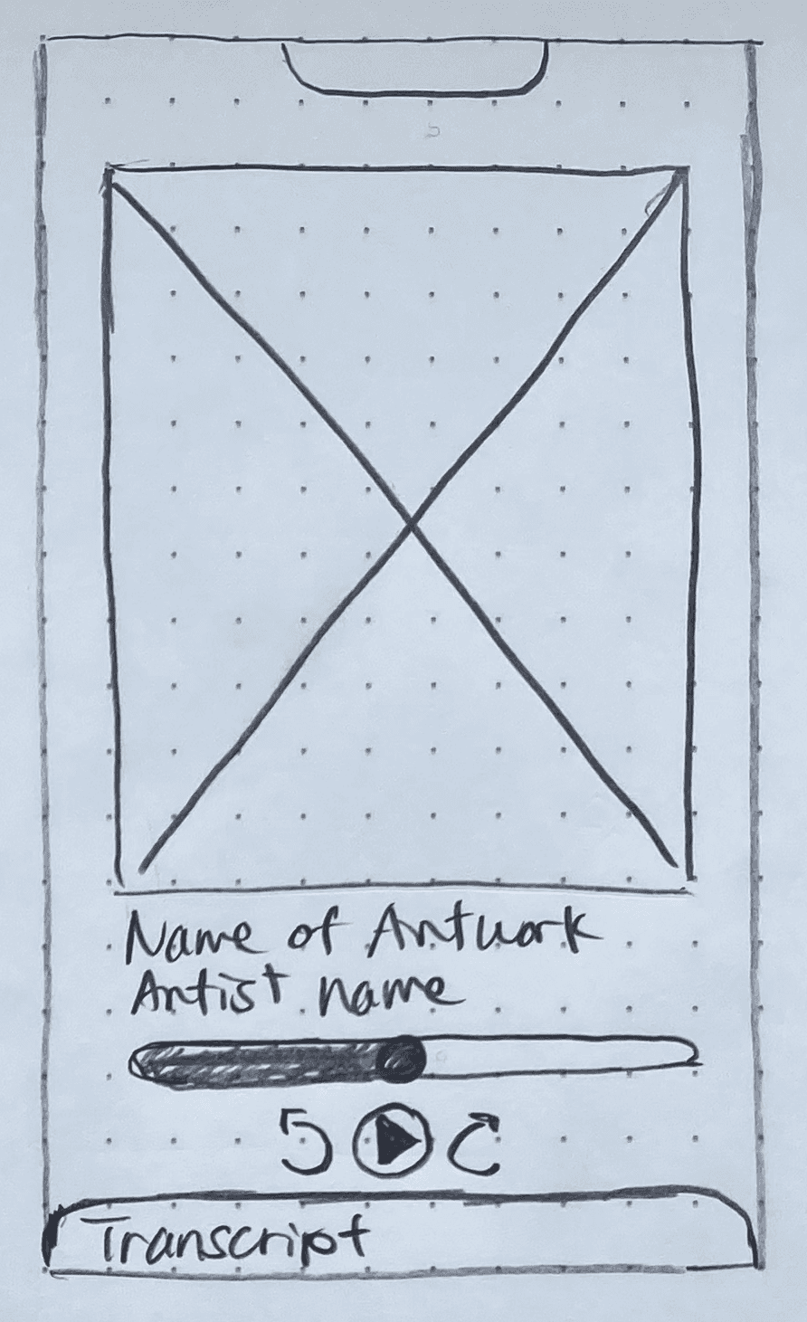
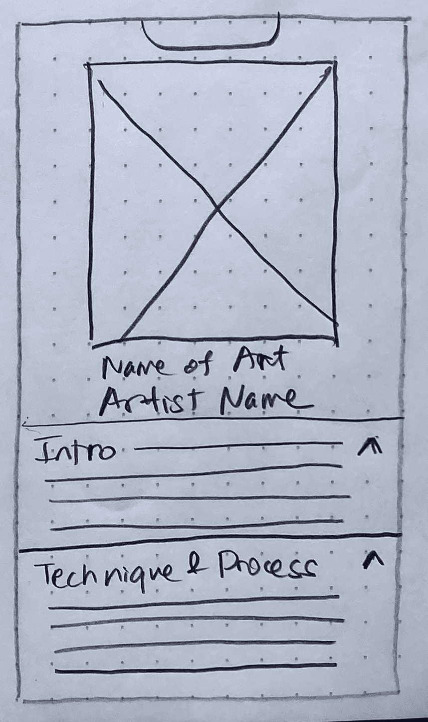
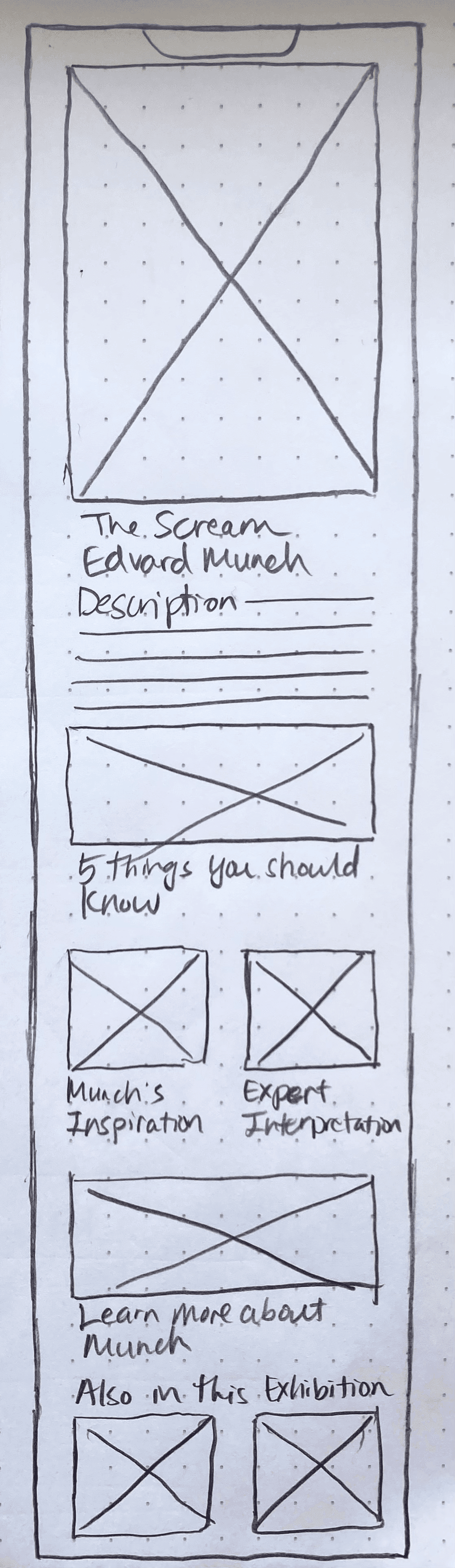
I decided that the page that displays educational content about the art would be the most critical screen, since the user’s primary goal is to learn more about the art.
Creating multiple sketches allowed me to explore different possibilities for what this screen could look like. I explored audio content, textual content, and video content in different visual formats. I also had to consider how content about one artwork would relate to content about another artwork.


Solution Sketches
I created further sketches to show two ways of identifying and retrieving information about an artwork that the user sees in person.
Solution #1: Scan the artwork with the scanning feature to learn more about it
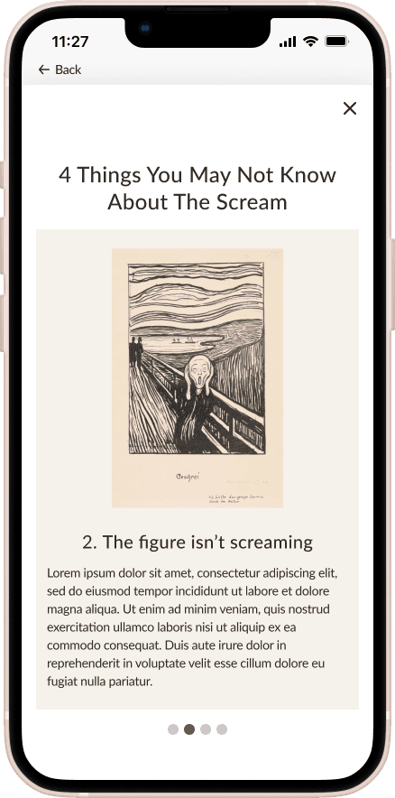
Once the app identifies the artwork, it will display information about it broken up into different sections and different formats. The user can quickly scan the page to receive quick information about the art. If they want to learn more, they have the option to open up a special feature, such as an audio guide.


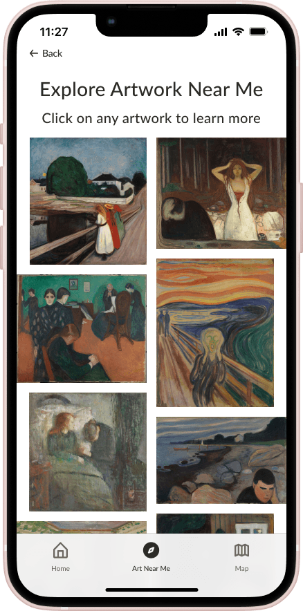
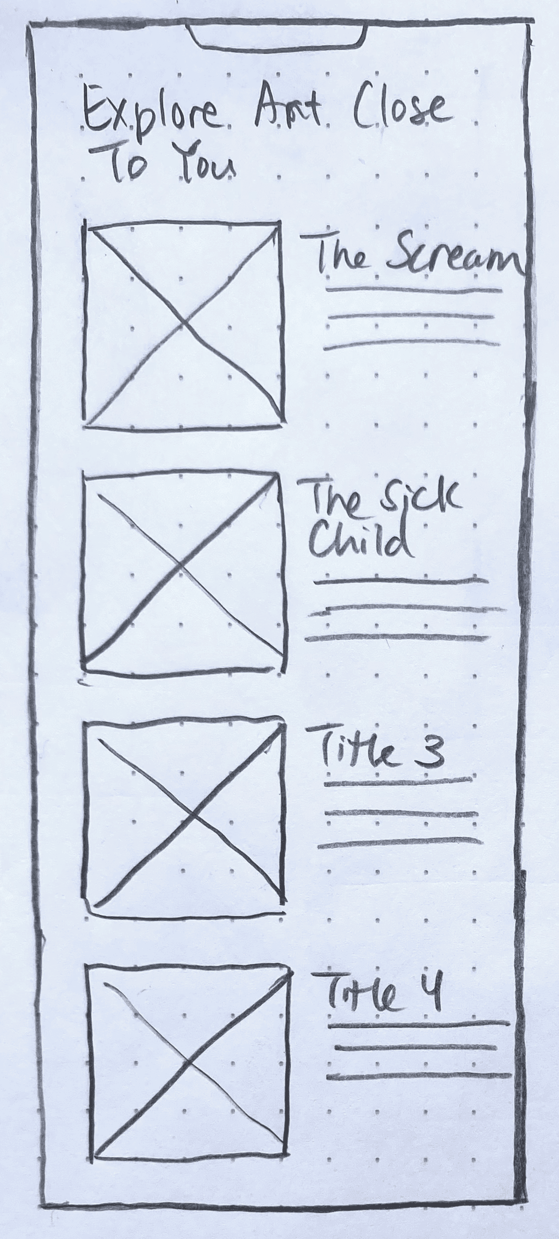
Solution #2: View a list of artwork that's physically nearby and select one to learn more about it
With this method, the user doesn’t have to go up to the artwork to scan it. Clicking on the artwork from the “Art Near Me” page will display information about that artwork.

Day 3: Deciding on a Solution
Creating a Storyboard
I decided to go with the second solution and expanded the sketches into a storyboard. The storyboard represent's the user's journey starting from choosing an exhibition and ending with learning about an artwork that they see in person. I chose the second solution over the first because I realized it might be inconvenient for the user to scan the artwork if a lot of people are surrounding the art. Instead of scanning the artwork, the user can simply identify the artwork from a gallery of images determined by the user’s location.


Day 4: Prototyping
Building a Prototype
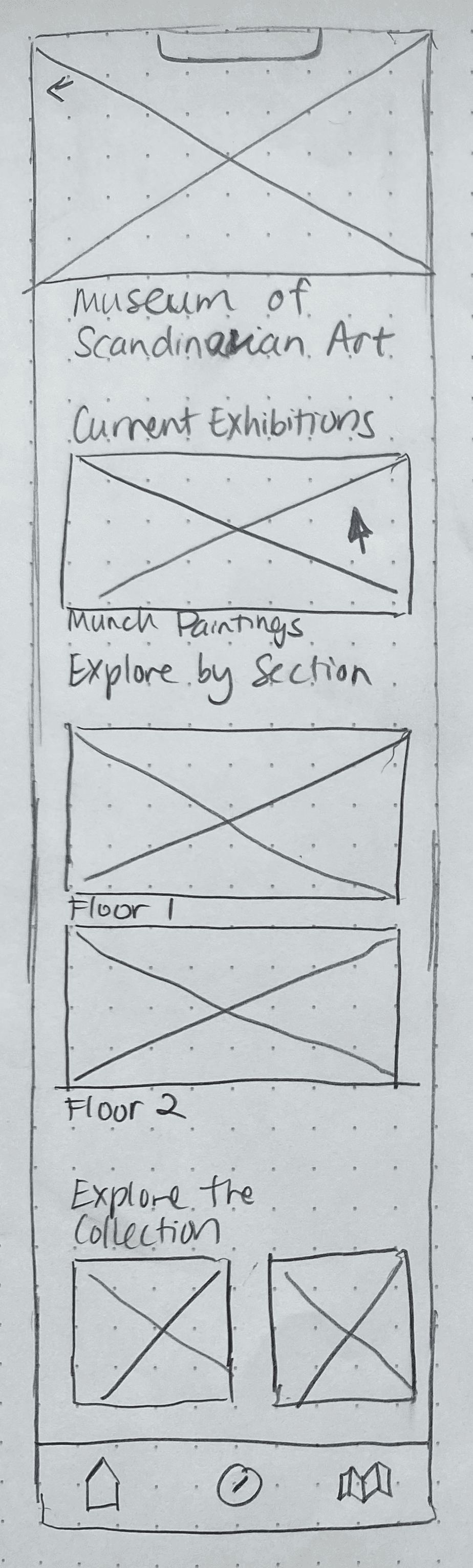
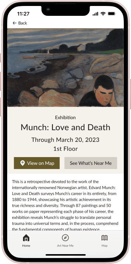
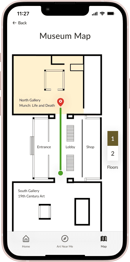
From the sketches, I jumped directly into creating high fidelity screens. The first page is the museum homepage which shows all the exhibitions on display and what each floor contains. From the homepage, the user will select the exhibition that they want to see, which will bring them to the exhibition page. The user will locate the exhibition on the museum map by clicking “View on Map.” After the user arrives at the exhibition and finds an artwork that they want to learn more about, they can go to the “Art Near Me” page, select the artwork, and consume information about it. The user has the option to click on the “special features” distributed throughout the page. Clicking on a special feature, will open up the content as an overlay.


Day 5: Validating the Solution
Usability Testing
To uncover any usability issues with my prototype, I conducted usability testing with five users.
During the testing sessions, I asked users questions such as “If you see an artwork right in front of you and want to learn more about it, what would you do?” I received a lot of insightful feedback that challenged my assumptions and revealed areas in need of further improvement.
Issue #1: The Art Near Me” page is confusing

When I asked users to learn more about an artwork that’s right in front of them, none of them clicked on “Art Near Me.” They tried to arrive at this information through the Exhibition Page. Several were unsure of what the "Art Near Me" icon was for. Users were also unsure of how the artworks on the Art Near Me page were sorted. They were also unsure whether the page only shows art from the exhibition that they’re in or whether shows all art in the vicinity.
Recommendation: The page needs to communicate to the user that the artworks shown on this page are the ones physically closest to them within the exhibition that they’re in and are sorted by proximity. If the user is not inside an exhibition, the page should show a list of the nearest exhibitions. The images of artworks should be displayed in a logical sequence.
Issue #2: Need different ways for identifying artwork

Some users said that they would rather identify the artwork through a search or scanning feature rather than looking through a page of images. One user pointed out that browsing the “Art Near Me” page to find a specific artwork would be difficult if all the art on display looked the same. She also pointed out that this page wouldn’t be useful if the user wasn’t physically close to any art.
Recommendation: There needs to be a search bar and scanning feature to allow users to directly retrieve information about an artwork without having to browse through a page of images. The search bar and scanning feature wouldn’t require the user to be physically near any art.
Issue #3: Confusing and unnecessary items on the Exhibition Page

On the exhibition page, I have a button that says “See What’s Near Me,” a section titled “Art From Exhibition Near Me,” and a link at the bottom of this section that says “View All Artwork Near Me.” These elements are confusing and unnecessary. Users were unsure whether these phrases referred to art within the exhibition or art in the vicinity regardless of exhibition. Users felt that the “See What’s Near Me” button was asking the user to leave the page immediately. They pointed out that “Artworks from the Exhibition Near Me” and “View All Artwork Near Me” wouldn’t make sense if the user wasn’t near any artwork.
Recommendation: The “See What’s Near Me” button should be removed. The “Artworks from the Exhibition Near Me” section should be replaced with “Highlights from the Exhibition.” “View All Artwork Near Me” should say “View All Artworks in the Exhibition.” Since the “Art Near Me” page already serves the function of showing users the artworks in their vicinity, the Exhibition page should focus on showcasing exhibition highlights.
View Prototype in Figma
Conclusion
Next Steps
Due to the time constraint, I only designed the most crucial features that the user would need. If there were more time, I would reiterate the design to resolve the usability issues. These changes would include:
Creating a search bar and scanning feature to provide alternative ways of retrieving information about artworks
Delete the “See What’s Near Me” button and change the “Art from the Exhibition Near Me” section to “˙Highlights from the Exhibition”
Creating a search bar on the Map page

